
Cypress, TX | Ultrasound studio | 3D/4D & Diagnostic Ultrasounds
“Vida” means life in Spanish, and that’s exactly what this studio captures, whether it’s a first glimpse of a growing baby or important insight into someone’s health. Vida Imaging came to me needing more than a logo refresh. They’d built the business from the ground up without a designer in their corner. The original mark was a fine starting point, but it hadn’t grown alongside them. Their social following had taken off, and they needed a visual identity that could actually keep up and feel cohesive across every touchpoint.
At the heart of it, this is a brand for expecting moms, about 90% of their clients. Nurturing, curious, sentimental, busy, intentional. Women who want same-day answers, a comfortable space, and someone who treats a routine scan like the milestone it is. They also offer diagnostic ultrasound for anyone who needs it, so there’s real medical credibility underneath, but the soul of the brand is that first look at your baby.
Where they started
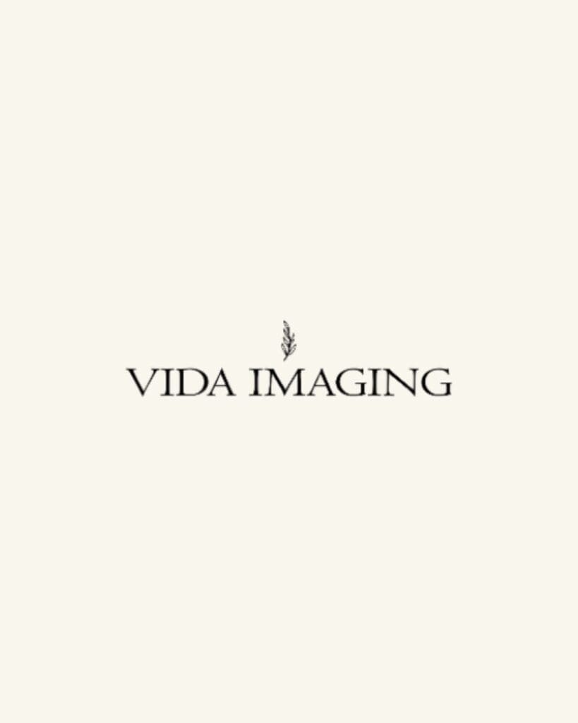
The original mark was a simple serif wordmark with a small botanical sprig above it. Pretty, but a little quiet. It could’ve belonged to almost any wellness brand, and it didn’t give them much to build on for merch, social, or print.
What we were going for
We landed on three words early and let them guide everything: loving, warm, welcoming. The idea was, if Vida were a woman, she’d wear soft neutral, earthy tones. She’s personable and nurturing, makes every patient feel like family, and brings a peaceful, uplifting energy to a visit that can otherwise feel nerve-wracking.
A few things were non-negotiable going in. Keep the neutral, earthy palette. Keep some kind of greenery or stem to represent life. And steer hard away from anything pink or blue, anything with a pregnant-silhouette or baby-icon cliché, and anything overly dark, busy, or clinical-feeling.
What we built
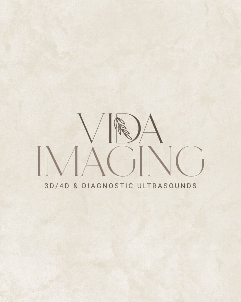
The new identity kept the elegant, editorial quality that fits a business people trust with their health, but softened it. More organic type choices, and a gentle nature-inspired mark.
From there, we brought it to life across:
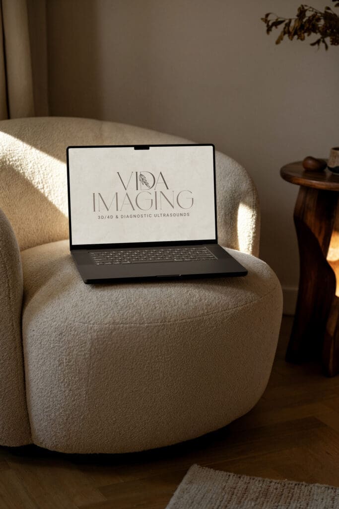
- A refined logo suite, the same soul as their original mark, but more considered, with room to flex across print, web, and merch
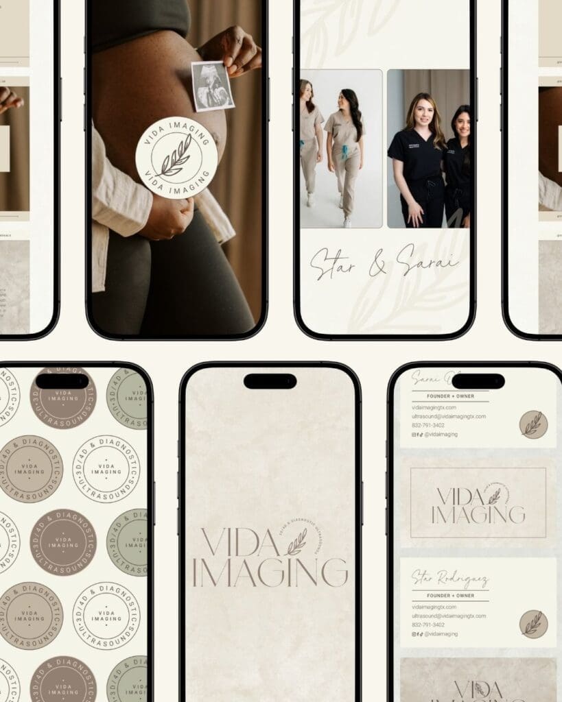
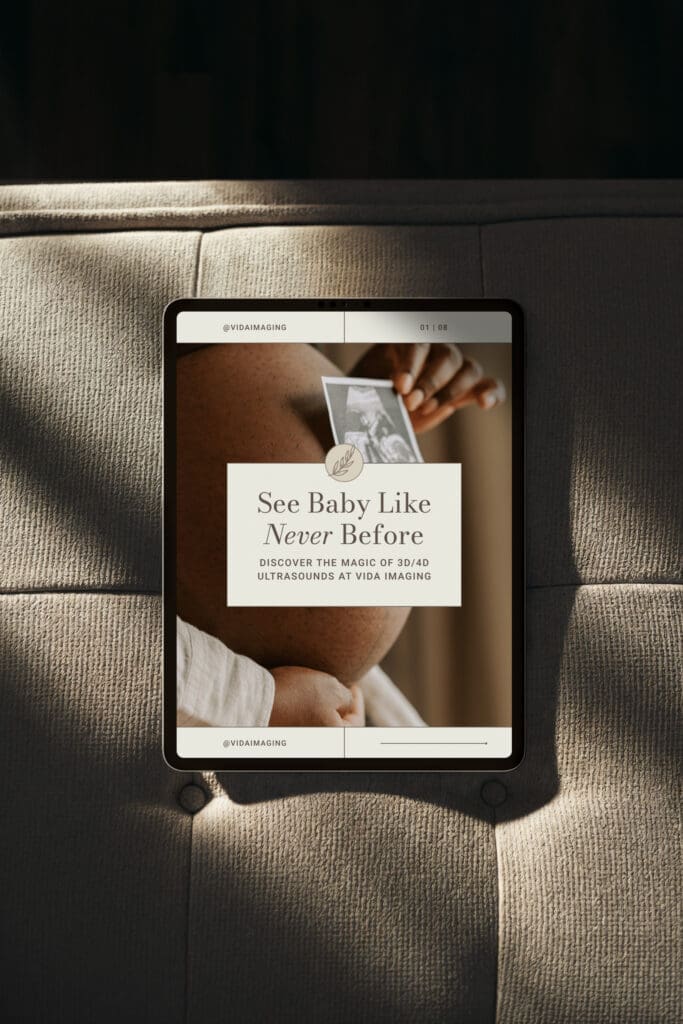
- Social media templates
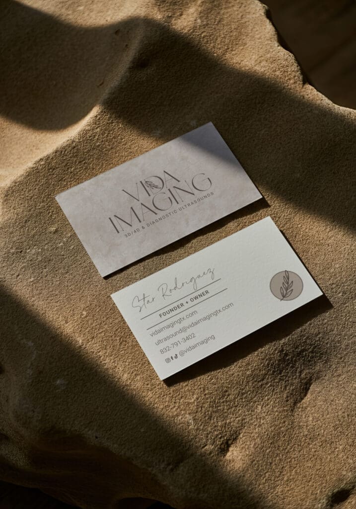
- Business card templates
- Textured backgrounds for socials
How it turned out
What used to be a nice-but-forgettable mark is now something that actually feels like them, recognizable and consistent whether it’s on their Instagram, their studio wall, or a business card in someone’s hand. It’s also a foundation they can keep building on as they grow. This identity was built to stretch with them, not box them in.
My favorite part of the project, honestly, was how much they trusted the process. They told me afterward that working together felt smooth and easy, and that they appreciated how organized and detail-oriented I was throughout, which, as a designer, is genuinely the best kind of feedback to get.
“Working with Rachel was such a great experience! She brought our vision to life and made the whole process so smooth and professional. We really appreciated how detail oriented and organized she was. We couldn’t be any happier with our new brand, we highly recommend her to anyone looking to elevate their business!”
– Star & Sarai
Before & after, side by side
Before: A quiet serif wordmark with a small line-drawn sprig, pretty, but not particularly them.
After: A full identity system built around one feeling: that a mom walking in for her first ultrasound should feel cared for from the very first glance.
Ready for a brand that actually feels like you?
If your business has outgrown its current look, or never quite had one to begin with, let’s fix that. I’d love to hear what you’re building and figure out how a Signature Brand could help it grow. Get in touch and let’s talk.
Be the first to comment